Business card redesign: feedback please?

Be sure to read and follow the guidelines for our forums.

Jul 13, 2016 5:32 pm
With GenCon around the corner, I'm thinking I should get more business cards printed. If I'm going to get new cards printed, I should rework the design, right? Because with only 3 weeks left, nothing quite like redoing your work last minute! Just wait till I make a change to GP before I get on my flight, unable to fix it for 3-6 hours!

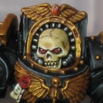
So I'm thinking of keeping the back the same:
http://gamersplane.com/images/businesscards/back.jpg

This is my current front:
http://gamersplane.com/images/businesscards/front.jpg

Here's what I'm looking to change to:
http://gamersplane.com/images/businesscards/v2_front.jpg

And I wanted to see what it looks like centered instead (don't like it):
http://gamersplane.com/images/businesscards/v2_front_centered.jpg

Thoughts on the new design? Any better ideas overall? I'm not sure I like the curvy font; suggestions?

Note: the cards don't have black borders, I just added that so you can make a comparison on how they actually look.
Jul 13, 2016 5:41 pm
As far as positioning, I actually like the vertically-centered logo, but that's my personal taste and I'm not knowledgeable of what makes a business card "work." I think if the separating red bar wasn't dividing the logo from the GAMERS PLANE text, perhaps then the top-level logo would be good.

For the font, I usually prefer easy-to-read letters, so I'm not very fond of the lowercase E; it seems so out of place compared to everything else.
Last edited July 13, 2016 5:42 pm
Jul 13, 2016 5:41 pm
I like the fact that the logo only appears once (not redundant) and you're right, it looks kinda weird when centered vertically. That's a lot of negative space underneath the logo when it's up top, though that's not necessarily a bad thing.
Last edited July 13, 2016 5:55 pm
Jul 13, 2016 5:43 pm
Maybe putting the logo 2/5 or 1/3 the way down instead of how high it is now vs centered?
Jul 13, 2016 5:57 pm
Yeah, that should do it. But that's just my opinion. :-)
Jul 15, 2016 4:16 am
I may be onto something! Feedback!

v5
http://gamersplane.com/images/businesscards/v5_front.jpg

http://gamersplane.com/images/businesscards/v5_back.jpg
Jul 15, 2016 7:57 am
I agree, the new one is much more aesthetically pleasing, though I also don't claim to know what makes a business card 'work'.
Jul 15, 2016 10:41 am
I don't know if it's good or bad, but the front side is seriously dominated by the GP logo.
If it is supposed to be a business card mainly for GP, it's cool.
If it is supposed to be a business card mainly for Rohit Sodhia, it's too much.

EDIT:
But I definitely like the subtle background patterns.
Last edited July 15, 2016 10:42 am
Jul 15, 2016 12:40 pm
I REALLY like the new one!
Jul 15, 2016 12:43 pm
I like the last one best, too, although they all look good pretty to me.

I wonder if the Gamersplane.com needs to be more prominent. Maybe I'm over thinking it.
Jul 15, 2016 12:49 pm
Qralloq says:
I wonder if the Gamersplane.com needs to be more prominent. Maybe I'm over thinking it.
That's an interesting though it hadn't considered...
Jul 15, 2016 4:07 pm
You can all tell I'm indecisive and haven't found what I'm looking for yet.

v5.2
http://gamersplane.com/images/businesscards/v5.2_front.jpg

v5.3
http://gamersplane.com/images/businesscards/v5.3_front.jpg
Jul 15, 2016 4:23 pm
If I had to choose between 5.2 and 5.3, I'd pick 5.2. I just like the fade.

However, I still like the version here better.
Jul 15, 2016 7:46 pm
Yeah, that separating line suggests me that the logo and everything else are separate things.

If it somehow separated GP info and personal info, that would look justified for me.

Could you give us a layout with the name at the top / bottom, separated from all the GP info by that red line?
Jul 15, 2016 7:58 pm
Well, there is no difference between personal info and GP info here; it's my name, but otherwise all the info is GP in general. And I keep my name on there to make sure it stays personal. When you say to put the name at the top/bottom, do you mean the GP title or my personal name?
Jul 15, 2016 10:12 pm
Okay, studied in desktop publishing here so I can definitely give you good advice. Your original idea had really good merit, because the eye will flow naturally from the logo to the text next to it. v5.3 definitely looks cleaner, but I'd move the logo bak up, and your text back down a bit, so the the logo aligns with Gamers Plane again. In fact, since you already have the name on the back, I'm wondering if its not redundant to have it twice. You should probably use the extra space to put in your name bigger. And if you insist on having Gamers Plane again on this side of the card, put it smaller underneath the logo.

Edit: This might help better;
http://i64.tinypic.com/15ziiae.jpg

Edit 2: Now that I think about it some more, maybe you could put v5's logo to the left instead of just putting Gamers Plane underneath the cube...
Last edited July 15, 2016 10:25 pm
Jul 15, 2016 10:29 pm
Actually, if you look up at the v5 back, there's no more text there, just the GP logo and a bit of the hex bg fading out.

The more I look at 5.3, the more I realize the whitespace balance is off. And I tried the logo aligned with the text initially; it looks too much like a header instead of a business card. More and more, I'm finding myself drawn back to v5(.0). It seems the msot balanced. I really like 5.3 because of the bg and split, but it doesn't... flow.
Jul 15, 2016 10:39 pm
http://i67.tinypic.com/155hv7l.jpg
Don't be afraid of white spaces. White can be used to fill spaces. ;)
Last edited July 15, 2016 10:42 pm
Jul 15, 2016 11:10 pm
Oh, I love white space; I just don't like the balance the white space here is giving. In 5.3, I don't think there's enough white space; it feels cramped. The ratio of the left section vs the right feels off. I also don't like the idea of separating my name from the rest of the contact info. v5 also feels the cleanest, most organized. It's not quite right, but it's something...

v5.4 (not a huge fan of this)
http://gamersplane.com/images/businesscards/v5.4_front.jpg
Jul 15, 2016 11:23 pm
How about something like this?
http://i66.tinypic.com/k2b6tj.jpg
Last edited July 15, 2016 11:24 pm
Jul 15, 2016 11:47 pm
The more I look at the split design, the less I like it, heh. Def don't like bringing so much attention to my name... it's not about getting people to contact me, it's bringing attention to Gamers' Plane.

v5.0 (colorized)
http://gamersplane.com/images/businesscards/v5.0_front.jpg
Jul 15, 2016 11:57 pm
Keleth says:
it's not about getting people to contact me, it's bringing attention to Gamers' Plane.
Then the last one is the best in my opinion.
Jul 16, 2016 12:01 am
greenvoid says:
Keleth says:
it's not about getting people to contact me, it's bringing attention to Gamers' Plane.
Then the last one is the best in my opinion.
Indeed, if the focus to raise awareness of the site's existence, then the logo definitely needs to be in prominence. In that case, you could even remove your name entirely.
Last edited July 16, 2016 12:02 am
Jul 16, 2016 12:05 am
kalajel says:
greenvoid says:
Keleth says:
it's not about getting people to contact me, it's bringing attention to Gamers' Plane.
Then the last one is the best in my opinion.
Indeed, if the focus to raise awareness of the site's existence, then the logo definitely needs to be in prominence. In that case, you could even remove your name entirely.
I don't want to remove my name entirely as I want to leave it personal as well. I also use it when reaching out to companies or organizations, so a name is necessary (so they remember who they're contacting).
Jul 16, 2016 12:11 am
Okay. v5.0 colorized seems like a keeper then. If I had any tweaking suggestion to offer; name a bit smaller (by about 2-4 points), contact info a bit larger (by about 1 or 2 points).
Jul 16, 2016 12:12 am
I'll try it out. I'm gonna sit on colorized vs the black bg pattern, but I'll go between those.
Jul 16, 2016 12:43 am
So I wanna increase the contact info as mentioned, but the facebook link is too long... Would

/GamersPlane next to the Facebook icon make sense? I'm not sure...

Also, thanks to all of you with all the advice, thoughts, and feedback. As you may have noticed with these cards, with my site design, I'm never quite sure what's good, specially with my own work.
Jul 16, 2016 1:02 am
Keleth says:
So I wanna increase the contact info as mentioned, but the facebook link is too long... Would

/GamersPlane next to the Facebook icon make sense? I'm not sure...

Also, thanks to all of you with all the advice, thoughts, and feedback. As you may have noticed with these cards, with my site design, I'm never quite sure what's good, specially with my own work.
As in it gets in the way of the e-mail address opposite it? Maybe you can try pairing it with this site's url or the twitter handle instead?
Jul 16, 2016 3:27 am
kalajel says:
Keleth says:
So I wanna increase the contact info as mentioned, but the facebook link is too long... Would

/GamersPlane next to the Facebook icon make sense? I'm not sure...

Also, thanks to all of you with all the advice, thoughts, and feedback. As you may have noticed with these cards, with my site design, I'm never quite sure what's good, specially with my own work.
As in it gets in the way of the e-mail address opposite it? Maybe you can try pairing it with this site's url or the twitter handle instead?
That's what I was thinking, but I was hoping to figure out a way to keep Twitter and the web address higher, as they're the primaries.
Jul 16, 2016 4:49 am
Keleth says:
That's what I was thinking, but I was hoping to figure out a way to keep Twitter and the web address higher, as they're the primaries.
And yet other people might consider them primaries because they're both on the left...
Last edited July 16, 2016 4:49 am
Jul 16, 2016 5:03 am
kalajel says:
Keleth says:
That's what I was thinking, but I was hoping to figure out a way to keep Twitter and the web address higher, as they're the primaries.
And yet other people might consider them primaries because they're both on the left...
Good point; I'll look into that.

You do not have permission to post in this thread.